

2022 everything Hospitality + Home Interior Design Color Launch
January 10, 2022


Repurpose + Restyle + Refresh
Inspired by the world around us, we, at everything HOSPITALITY, believe it’s important to Ponder + Personalize + Plan out all the intricate details when creating your space. Regardless of the size or location of your project, every design begins as a blank canvas which is then filled with color, pattern, textures, and personality to ultimately create your masterpiece.
It is said we are a product of our environment, and our surroundings should reflect one’s personality, provide functionality and comfort; drawing you in and leaving you inspired. Color can transform our interiors and uplift our moods instantly as well as provide a powerful statement when used in the right application.
As the New Year begins, we are excited to announce our everything HOSPITALITY Signature Color Palette for 2022 that highlights and forecasts our take on the most popular colors and how one can easily integrate them into your space.
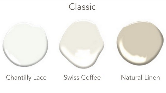
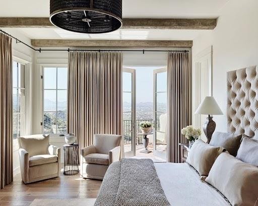
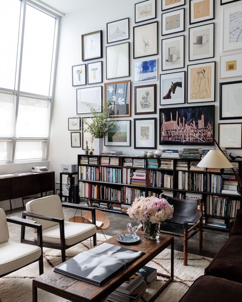
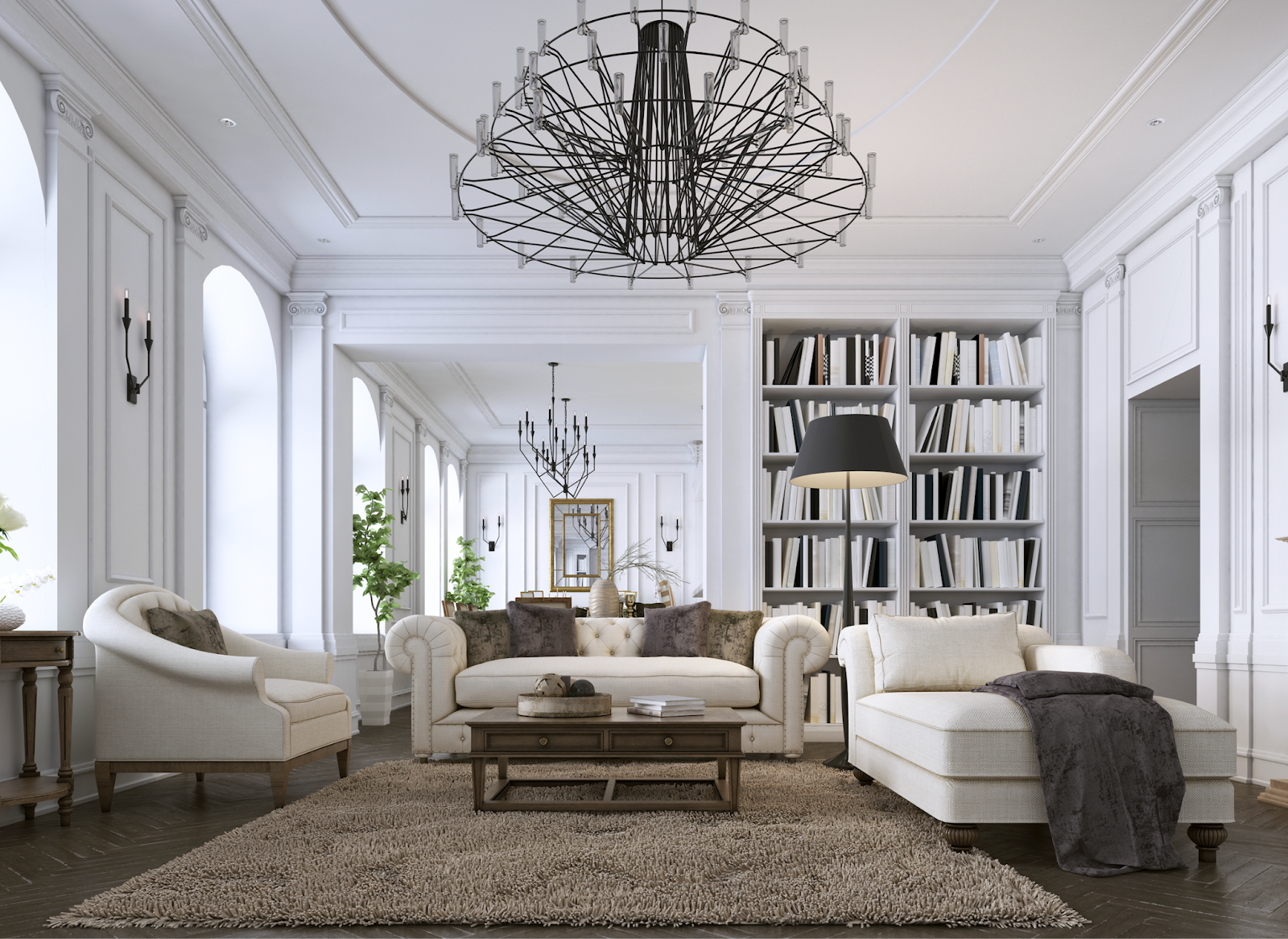
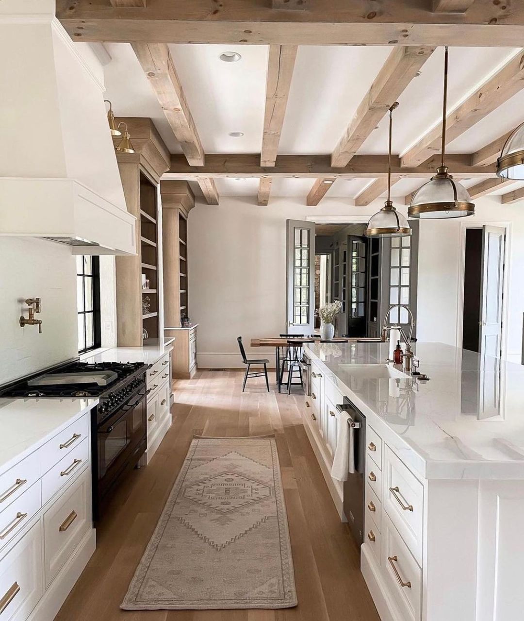
- Classic Colors = Timeless + Liveable + Inviting
These visual neutral colors are a critical building block to any interior space as they provide visual relief, an impartial backdrop, and a tranquil atmosphere, especially when paired with stronger colors. They are the versatile workhorses in all design stories that can be used as a center stage or in the background that helps seamlessly marry all design styles into an inviting, livable space.
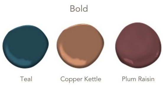
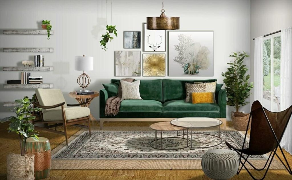
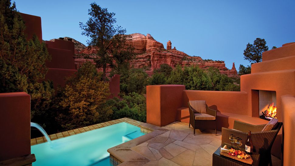
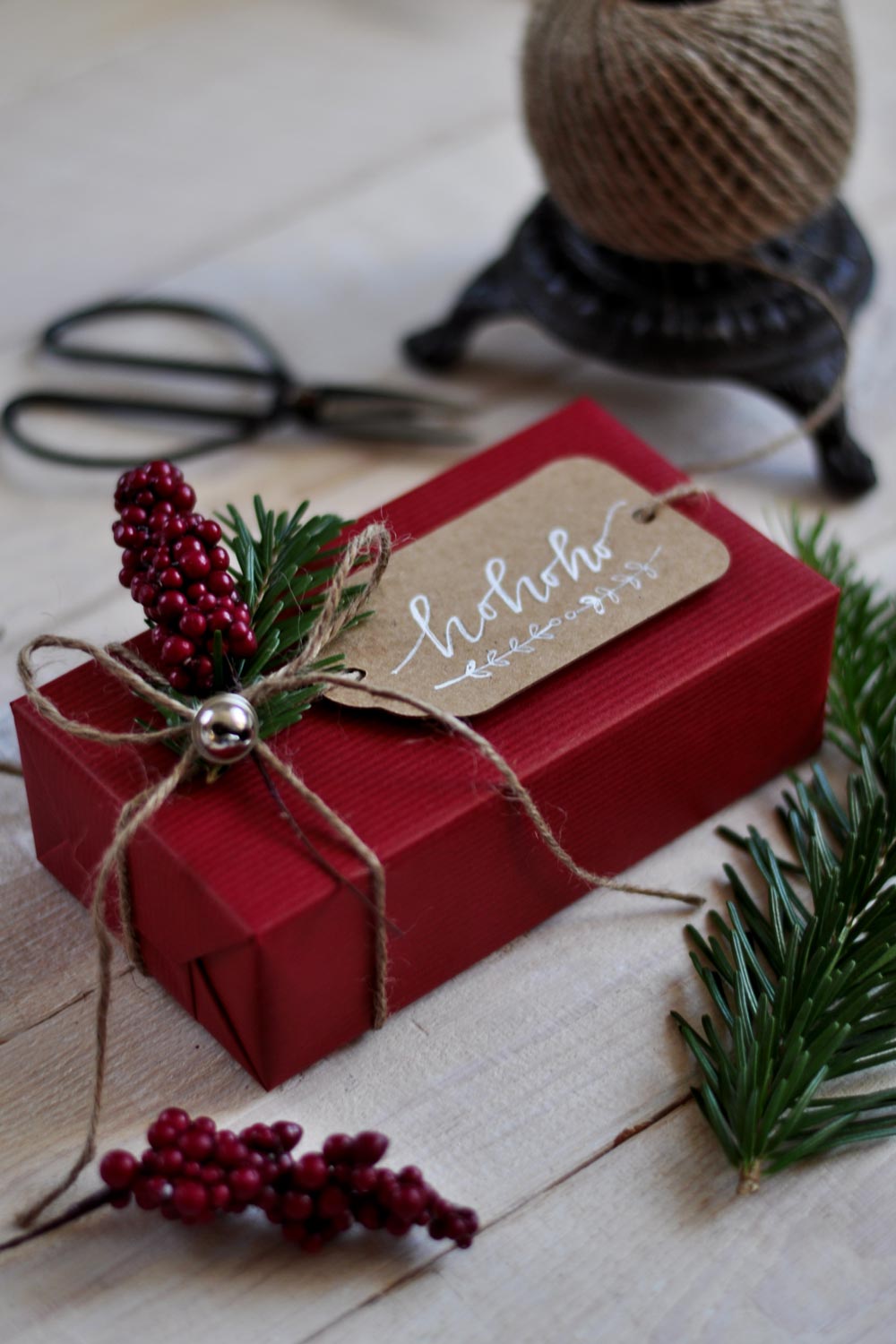
2. Bold Colors = Rich + Strong + Statement Driven
Incorporating bold colors can be a great way to evoke emotion, drama, and depth to a space but it should be carefully integrated so that it does not overpower the room. These colors can be quite dramatic and when introduced as a statement, it helps set the tone for the space. Consider using varying shades of one color for a bold and monochromatic look or incorporate these strong statement colors as strategic accent pieces. For example artwork, throws, pillows, faux florals and rugs, all allow for flexibility and freedom to change your space with time, yet they also create an impactful way to incorporate these bold hues into your room. Regardless of which way you go, it’s important to strike a balance and layer in the color to help create visual rest to help solidify that statement you are looking for.
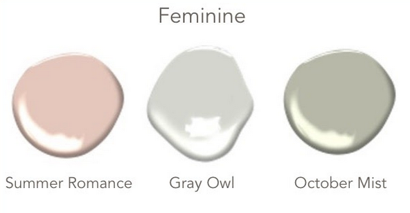
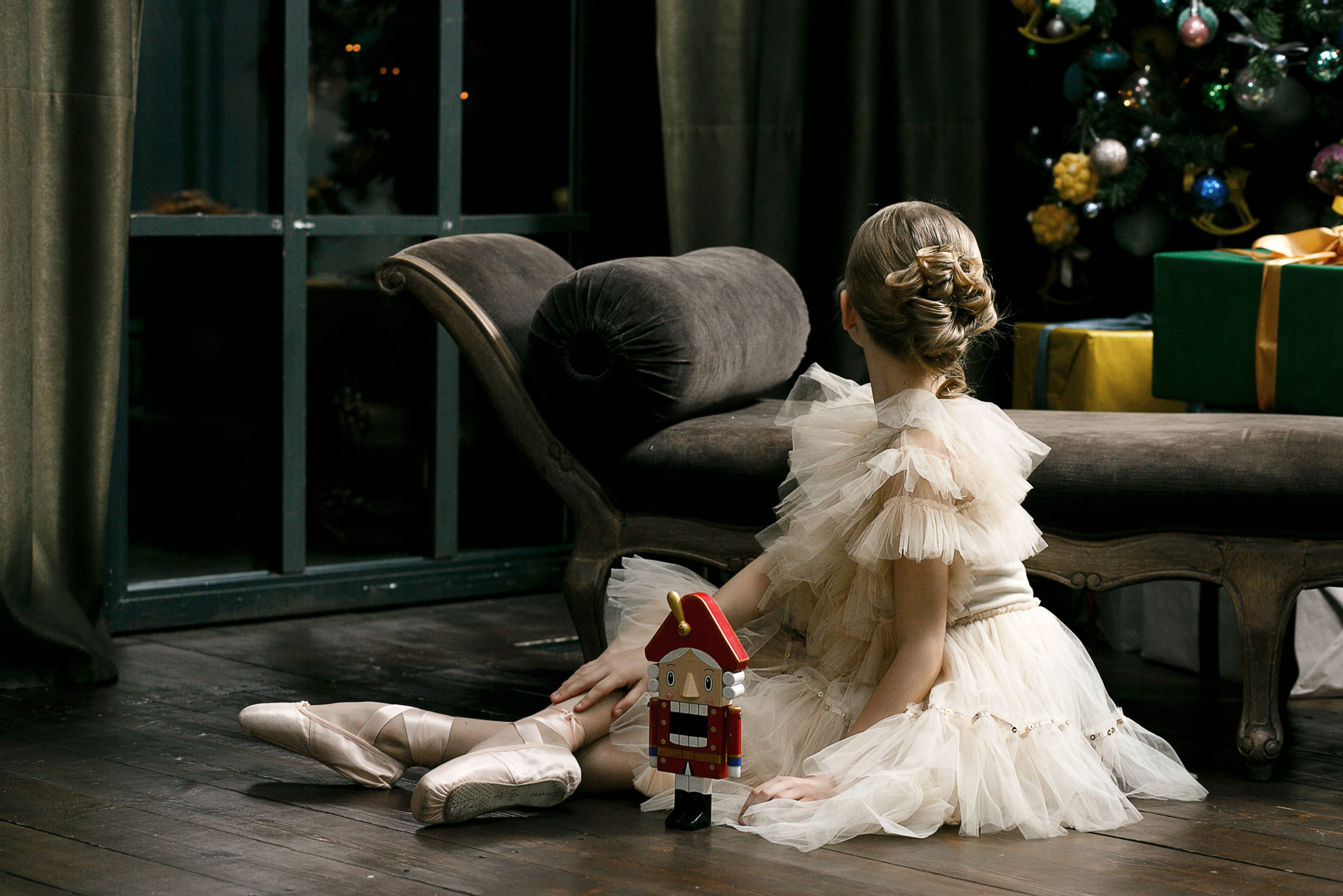
3. Feminine = Artistic + Comfortable + Tranquility
Often described as lovely, beautiful, and romantic, colors that are influenced by the feminine appeal tend to be softer and tranquil yet also provide a fresh, young vibe to any space. For example, combining soft blush tones with bold black furnishings creates an unexpected but artistic approach to a space that is vibrant and soothing all in one. This color palette also provides an opportunity to create a new neutral base that delivers versatility as it pairs nicely with many different color schemes and styles.
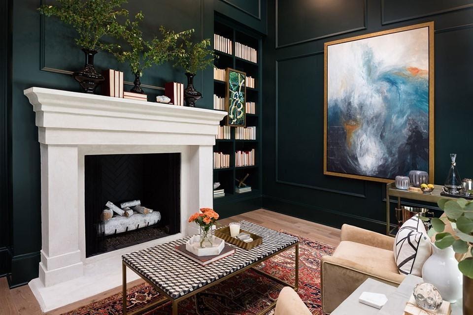
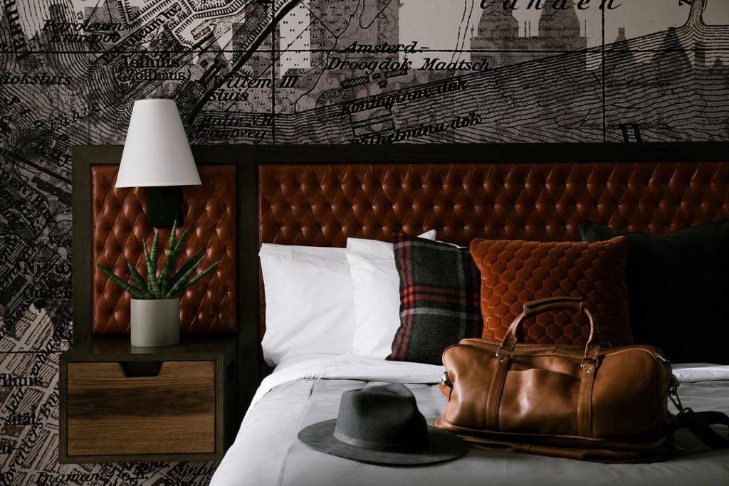
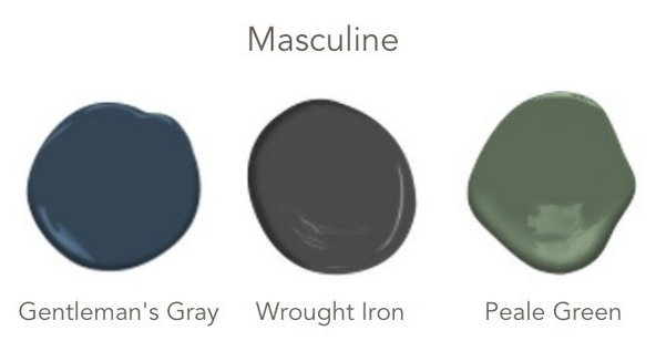
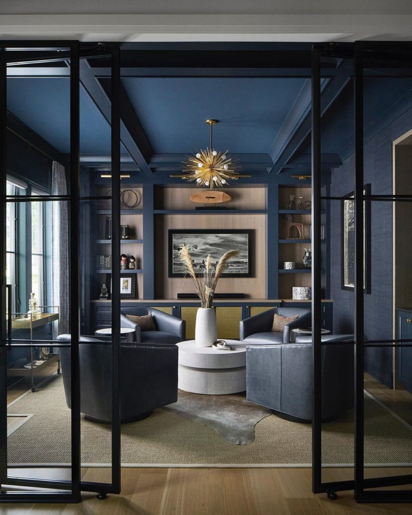
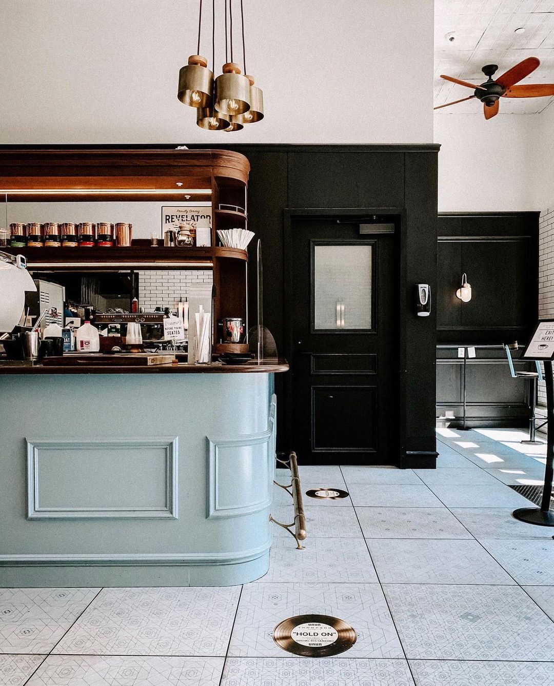
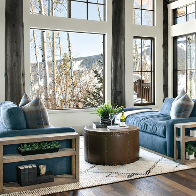
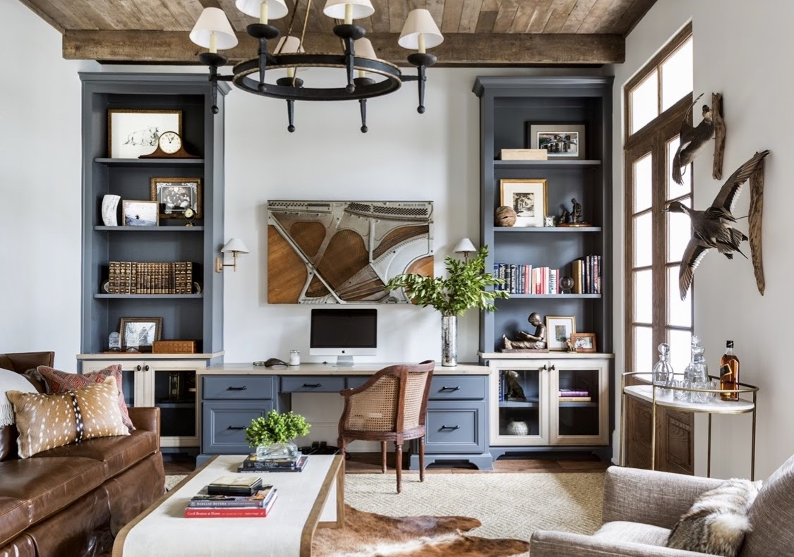
4. Masculine = Craftsmanship + Sophisticated + Character
These strong and moody hues create the perfect backdrop to elevate your space and incorporate a unique level of sophisticated style into any room. By carefully combining deep, rich, and saturated colors with various textures (rugged or smooth woods, various stones, fine leathers, and fresh metals) the opportunities are endless to complete the look you are going for that evokes character and energy with a sense of calm.
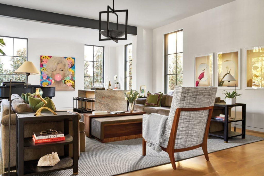
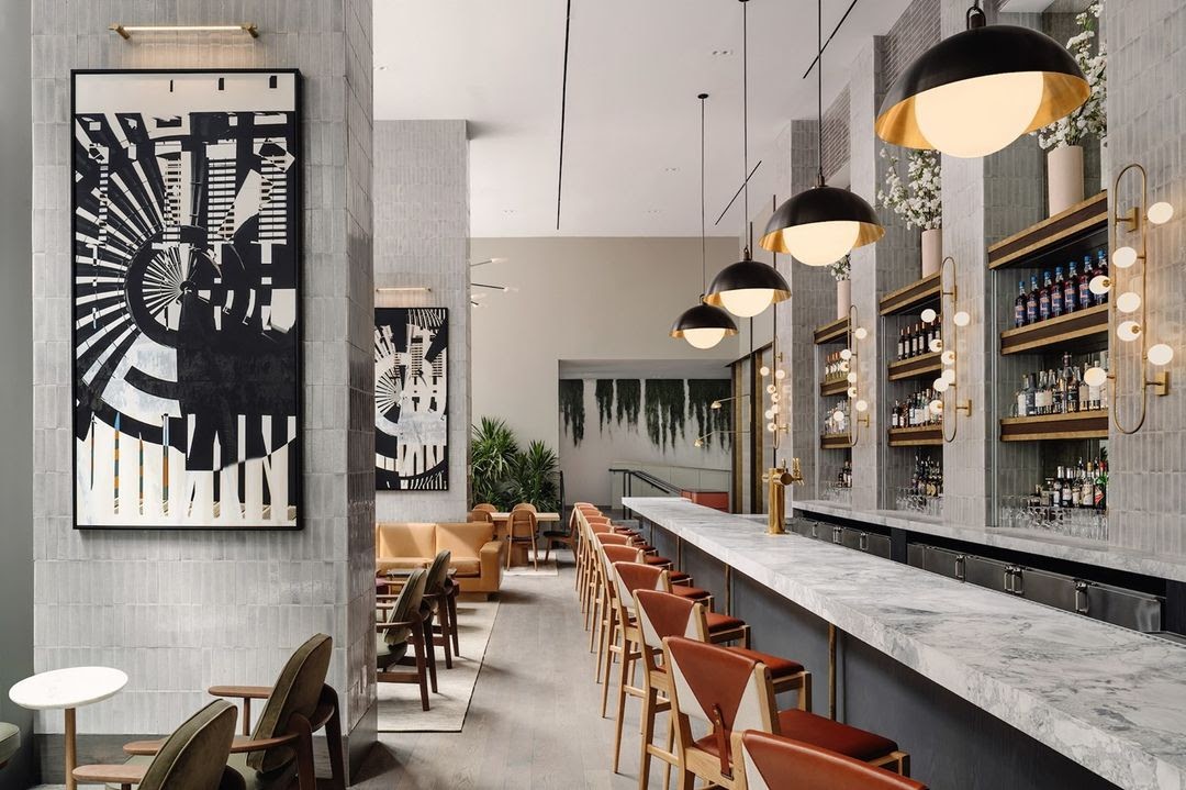
5. Livable Luxury
Whether you are looking to take on a full renovation or incorporate a few key pieces into your space, our 2022 everything HOSPITALITY Color Palette can be introduced in many ways. The most obvious option would be by incorporating the color on your walls, but consider these options as well:
- Throws + Pillows for practicality + accents
- Comfortable + Sustainable Furniture for impactful pieces
- Turkish Oushak + Kilim Rugs for their saturated, rich + bold colors
- Focal Art + Gallery Walls are impactful ways to capture memories and tell your story
While color is just one element that impacts the mood you are creating, it is a powerful and expressive tool that helps set the tone and creates a connection. We invite you to be inspired, explore new opportunities to introduce these colors, and more importantly let it express the masterpiece that you are.
“Because the way you do anything, is the way you do everything”
everything HOSPITALITY
Previous Post
Next Post

Follow me on Social Media as everything HOSPITALITY
Sharing real life together
PO Box 112
Nolensville, TN 37135
hello@everything-HOSPITALITY.com
stay connected
+ Show / Hide Comments
Share to: